
Both being fans of Team Fortress 2, a friend (Pieter Hoekstra) and I decided to take three weeks and create a capture the flag-map. After lining up our desktops and stocking up on easy food we tirelessly played the official maps, all the time making notes, discussing what made the maps great, and thinking about what could make them even better. Pretty soon we were sapping sentries and ‘ubercharging’ Heavies in our dreams which seemed to be a good moment to start on the design.
Goals
After that the very first thing we did was listing the important goals that we wanted to achieve.
The map should…
- Provide interesting options for all available playable characters
- Guide players to important areas without them getting lost or confused
- Given the deadline, focus on gameplay instead of visuals
Additionally we wanted the map to stand out from the crowd by using unique elements that create a map with a playstyle of its own.
Unique elements we decided would be…
- Adjacent flags
- An action-heavy chokepoint in the centre of the map
Later on we added the following to the list…
- Clever use of glass to create high visibility and a superior tactical overview
Layout
TF2 CTF maps are always mirrored so that both teams have the exact same chance of winning. This causes player skill to become the sole success factor. Even the slightest imbalance in the sides can make everyone try to get on the better side. If this is not possible, people will leave the game, and that is obviously not what we wanted.
So we did not want to deviate from this as balancing asymmetric maps in which both teams have the exact same objective is a very time consuming task. (Every advantage on one side needs to be counteracted by an advantage of equal level on the other. This can only be achieved by playtesting and tweaking constantly.)

In this first version of the map you can clearly see the player spawn locations connected to the flags and the arena which are both situated at the centre. The height differences are colour coded: Red – First floor; Black – Ground Floor; Green – Basement.
We translated this top down map directly into the game, created the basic pathways and ran around to check the sizes.
With just the hallways it was time for the first playtest. A map in this part of the process is never balanced and not fun, but it is still an essential part: You get to feel the size and routes of the map without the feedback being contaminated by other aspects of the level.
At the end of this playtest it should be clear what routes will be main routes, which routes are redundant and how well the all the distances relate to each other.
Getting the size just right
As often is the case when mapping for a game for the first time, it’s hard to get a feel for the right proportions of the map. CTF_Eden was no exception to this and was without a doubt far too big. Players were spending most the time running towards the centre, and the centre itself could house a whole map. The areas at the back of the spawns were not used at all as they weren’t part of the routes between the most important points (see image).

Image: How points of interest are connected in TF2 CTF maps. Any area not contained in this diagram is redundant.

Image: Side view
So we scaled down the map in its whole and removed the lower areas (green) that weren’t being used.
This newer version, seen from its side here, was a big step in right direction: Players were having interesting combat encounters in all of the areas.
Guiding the player
An important part of creating multiplayer maps is making sure the challenge is created by opposing players, not by navigating the map. The occasional jump to get to a health pack or shortcut is perfectly fine but you don’t want players falling to their death when trying to get to the centre or – which was the case in CTF_Eden – getting lost.
If you’ve played TF2 before you’ll notice that, even in the symmetrical maps, it is pretty hard to get lost. This is because this game uses a very simple, yet highly effective, means of guiding the player:

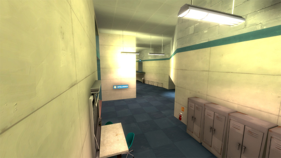
The colour coding is used to differentiate the two sides and the signage shows the fastest way to get to the points of interest. After successfully applying these techniques in CTF_Eden, we fill in the most important area…
Focus: Creating an action-packed centre
As defined in the initial plan of CTF_Eden, it was important to make this the area where most of the action happens. In the next image you can see the evolution of the high level layout of the centre. The only element that remained the same until the end is the amount of routes that lead in and out of the area.

Version 1
Gave players too much options to get to the other side of the centre. Often players were able to take one of the two side-routes without even being seen. This was not our intention as players carrying the intelligence should encounter resistance on their way back to score.
Version 2
Admittedly solved the issues of v1, but introduced a new one that was just as bad: It was almost impossible to get to the other side. Going through the middle meant one of three things: Getting mowed down by a Heavy, shot in the head by a Sniper or blasted into a million pieces by a sticky Demoman. We had gone too far in creating predictability of the enemy…
We did however like the battle-lines in this version. It felt like a battlefield between two armies.Version 3
The final version has additional cover and introduces an alternate route that goes over the battle-lines created in v2. This made crossing to the other side viable again, whilst keeping the battle-lines intact as players are still required to pass through the very middle of the map.

Design decisions in the area:
- The doors located on the alternate route are a border between safe and unsafe territory and block a long line of sight. It was extremely important that these doors were reliable as they are located in a ‘danger zone’. A player dying due to being blocked by the door would be an unforgivable crime and therefore we created a single trigger that encompasses both doors so that they will NEVER close when a player is in between them.
- The cover on the bridge makes it hard for players on the ground floor (excluding Pyro’s) to hit players that are using the alternative route. Additionally the horizontal cover also limits the power of snipers in this specific area.
- This solid wall makes sure players cannot exactly predict the moment players will come out of the doors when using the alternative route.
- The battle-lines are the fastest way of getting to the other side. It is however also the most obvious…
- Looking back I would have liked to stack some boxes here to create a way to get to the alternative route without being seen by enemies.
- Battlements that can be used to defend the centre. It contains supplies to keep the defender well stocked.
- The distinct theme tells players that they are in the centre of the map.
All of these elements combined create a bustling central area that has been tweaked just right for the gameplay we envisioned.
Focus: Using glass to create high visibility
One of the unique elements of this map is the location of the flags: adjacent, solely separated by one bulletproof glass window.


Playtesters really liked this idea and we gradually kept using more and more glass to give players views of other areas in the map (as you can see in the updated side view). The use of glass can create some great lines of sight, without affecting lines of fire. On top of that it can create some interesting situations in which players are able to see each other, but aren't in the position to act as is the case in the intelligence room.
The next couple of images show some examples of the glass being used in the final version of CTF_Eden.

Balancing
TF2 Class Balancing
For a large part, level design is about finding out what abilities a player has (e.g. jumping or shooting) and facilitating these in the best possible way. Use your levels to make these possibilities clear and reward people for combining abilities. A great example of this are the advantageous areas Soldiers can reach through rocket jumping.
This is VERY much the case in TF2. The class abilities are immensely diverse and the possibilities they present regarding to level design are… to be frank… daunting:

- Scouts are able to triple jump with the ‘Force-A-Nature’, Soldiers can rocket jump and Demomen can sticky jump. This created a lot of unintentional shortcuts and vantage points in the first version of CTF_Eden. We kept a couple of these areas intact, as we thought it provided a valid and, above all, fun strategy.
- Snipers require long lines-of-sight to be really effective. To make sure they don’t become overpowered it is common practice to create just a handful of great Sniper nests so players know where to watch. Snipers can counter each when the nests of both teams face each other.
- Engineers are another reason for creating clear routes. Engineer players need to be able to anticipate locations enemies emerge from. Think about these locations and help players find them through visual language.

Image: This potential turret location was too strong until we added the wall at the back. Now, Demomen can counter turrets by throwing grenades against the wall.
- The Demoman’s abilities make strong use of the environment: He needs to be able to throw grenades over walls and obstacles, and for his sticky bombs we need to provide enough doorways or tight corners.
- Spies need just one thing: Sneaky places. Breaking line of sight with pursuers and having relatively safe means of getting behind enemy lines is key to being successful as a Spy.
- Soldiers, as mentioned before, like high platforms that have a good views. A general guideline is that soldiers have an advantage in open areas.
- Pyros on the other hand have an advantage in close quarter areas so make sure you have both.
Player spawn locations
Official TF2 maps often contain multiple spawn locations for a team. The reasons for this are that multiple spawn locations do a great job of spreading teams, making the entirety of the map more populated. It also makes players less predictable, minimising basecamping.
The reason for basecamps being positioned between the centre and the flags is that this way defending players have an advantage when defending the flag due to a shorter distance.
From experience with different online shooters I know basecamping is one of the most important problems in multiplayer games with fixed spawn locations. TF2, however, has done a tremendous job minimising this problem through clever level design and supporting game mechanics.
Techniques TF2 uses to minimise basecamping are…

- Multiple basecamps at different locations (unpredictability)
- Multiple exits that exit in different areas (unpredictability)
- Double doors (breaks line-of-sight)
- Corners right before the exit of the basecamp (breaks line-of-sight)
- Drop downs (breaks line-of-sight) (not depicted)
In CTF_Eden we combined technique 1, 2 and 4 to maximise protection for spawning players.
Not related to the layout of the basecamps, but nevertheless important: Placing a supply closet in the base gives the spawning team a huge advantage when fighting around the base.
 Image: The final route setup of CTF_Eden
Multiple routes
Multiple ways of getting to an objective is of utmost importance as they create choices about “Which path to take” and “Where will the enemy come from?”
Many different elements can help make the decision:
- Where is my objective?
- Which path is the shortest?
- Which path is safest?
- What is my class and weapon loadout?
- What is my preferred playstyle?
If players always answer these questions with the same answer the routes are not set up correctly.
In CTF_Eden we created three routes from the centre to the intelligence. Two went around the edge of the map and one went straight through the middle. To stop every player from taking the shortest route we made the others more attractive by …
- making them sneaky (safer)
- giving them less spawn exits (safer)
- giving these routes flanking possibilities
- leading them through sniper nests for some potential kills
Visuals
As already mentioned, the focus of this map was to create a great gameplay experience within a limited timeframe. This meant we could not afford to spend too much time on the visuals of CTF_Eden. As a solution we worked out a minimalist theme as you can see in the next couple of screenshots.

Some visuals have a strong impact on the gameplay, and, of course, we couldn’t leave them out.
Firstly, we created two distinct themed areas: Interior corridors, and an exterior ‘garden’. We only used the exterior theme for the very centre of the map, so that players can use the exterior theme to (unconsciously) orient themselves.

Image: The garden theming is only used in the centre of the map.
Secondly, as already mentioned earlier, differentiating the opposing sides helps players keep them apart. There are two ways of doing this: The easy and the hard way. We chose the easy way by colour coding both sides with red and blue details.

The hard way is using details, geometry and prop placement to differentiate the sides, without impacting the layout and cover. An example of this could be having a statue at one side and a tree at the mirrored place in the other half. Both would provide the exact same cover but, visually, differ greatly.
Final Thoughts
Positives
- During the final playtests classes were well distributed meaning they were represented sufficiently
- The glass adds a lot to the gameplay of the map. It’s awesome when two enemy engineers are building turrets right next to each other, both at their own intelligence
- The middle of the map is well balanced and plays out exactly as we wanted it to
Negatives
- Middle area can be too chaotic and floor could use some more height differences
- Visuals are still important and not focusing on them is a missed opportunity for the map as a whole
- Even with the centralised chokepoint Scouts can easily slip by quickly and capture the intelligence
- Overall size is a little too small when there are more than 8 players
Creating this map has not only taught me loads about creating TF2 maps, but has also been an important source for learning more about FPS level design as a whole. It amazes me what can be achieved in such a short time by being focused.
I am confident in the design of this map and somewhere in the future I would like to give this map a visual overhaul and take care of the current problems.
Thanks for reading! Feel free to contact me for questions, comments and discussion. Also thank you to my teammate: Pieter Hoekstra.